Showing posts with label abstract art. Show all posts

Friday, August 15, 2014

There's a difference!

I'm wondering how often I think I know what I'm saying or feeling when I don't.  And it can cause problems.

As I have been anticipating and worrying about upcoming radiation therapy, I realized that I wasn't sure if I knew the difference between depression and tiredness.  I know that tiredness is sometimes a symptom of depression, but what if one is "just" tired and need sleep?  It doesn't seem like too much of a stretch to think that depression might also be a side effect of fatigue.

I took a linguistic side trip and discovered:
discernment stresses accuracy (as in reading character or motives or appreciating art) discernment
to know true friends>. discrimination stresses the power to distinguish and select what is true or appropriate or excellent discrimination that develops through listening to a lot of great music>.  So apparently I need to improve both!  What is true?  What is accurate?
And being such a visual creature, I sketched 4 little drawings in which I tried to depict both experiences.
Later I scanned and elaborated on each one.

 Depression, for me, is like a horrendous dark cloud that prevents me from seeing hope, choice, or even any changes in the future.  Fatigue is more a sense of being run down, wrung out and maybe not caring what choices and changes might be in store for me.  I think fatigue might need to be taken care of more immediately than depression.  Take a nap!  Or, paradoxically; the opposite -- get some exercise and THEN take a nap.
 The red flare represents the anger that can hide under depression's cloak.  It's there... AND it seems to come as a result of outside influences or obstacles.  The blue pool represents the deep tiredness... and it seems to come from within.  Where they overlap, there can be emotional riptides, eddies and shoals.  But beyond them, there is brightness, and a new day.
 This is a side by side comparison.  Depression on the left; descending from above and pushing one down... like a great burden on ones shoulders, or a huge hat made of lead that keeps you down.  On the right, that little black dot is a swimmer-- too far out to sea.  Possibly too tired to get to shore.  Not trusting the natural ebb and flow of tides, time or even a possible rescuer.
And a more graphic interpretation.  The oppressive red arrow pushing DOWN in comparison to the dark arrow trying to rise UP.  With so many little bumps, seeds, bubbles (or something) needing to be present, noticed and contended with.

How would YOU draw fatigue?  Depression?
One thing  I noticed is that doing the drawings helped me disengage from the grip of both emotions;  writing about them helped me figure out a lot about how I let them get the upper hand.


Monday, June 03, 2013

When is a store not a store? When it's a gallery.

A new friend of mine is having a grand finale exhibit at this gallery in June.  
Her  "opening" reception is June 8, from 5-7 pm. 
 .
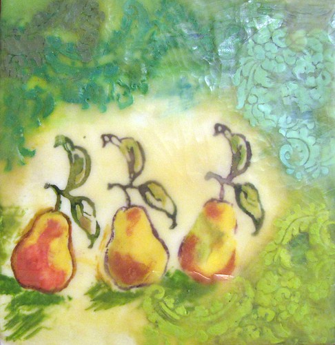
 So, I thought I'd check it out ahead of time.  I was SO much better (and different) than I expected.  May's exhibit was Momentum X:  celebrating the 11th anniversary of the New Hampshire Charitable Foundation’s Artist Advancement Grant,  which annually provides financial support to individual artists and craft people in this region. 
The so-called "winner" of the grant competition was Bear Kirkpatrick who makes amazing digital art.  Anyone who is still on the fence about whether "digital" is an art medium, need look no farther!
 
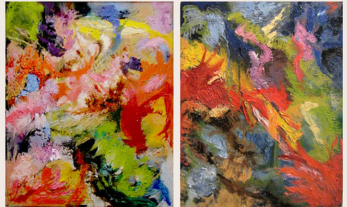
 The work which I would probably most like to have in my house is by Rose Umerlik.
Glossy yet primitive, formal but spontaneous, unyielding while human, she uses a limited palette in  fascinating ways.

 There is more of her work here.
But the work that seemed most like "Capital "A" Art" were the banners, quilt and book by Lauren Gillette.  It turns out that a book she produced a while back was a favorite of mine when I visited The Barn in Ogunquit.  Her ideas and media vary so much, it took me a while to put it all together.  Her sensibility, however, is constant.  She calls it being a "witness."  I call it "making the ignored unavoidable."

The lettering on the quilt asks, "Is there a right way to call a woman a slut?"  and was prompted by congressional hearings which devolved into sexist name calling (and slut-labels) over whether birthcontrol measures should be covered by health insurance.


 Peggy O'Neal probably wouldn't have attracted any notice if she'd been a he.... or if she had lived 150 years later.
 Pamela Churchill Harriman sounds so interesting, I'm going to see if there is a biography in print! Yay!! There are at least TWO!.

 There was a banner of noses, faces and anti-semetic remarks.  Just like 5th grade, you were supposed to match which went with what.

 There was a small "key" next to the banner.  I had no idea how prevalent nasty remarks were and continue to be.
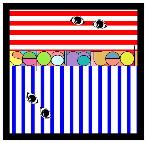
 A "book" made of VERY heavy paper combined color samples with "names" that (sort of) go with the heading at the top of the page.


 And, to me, the piece de resistance... The Racist's Skin Tone Color Chart.
I think that locales which are MOST racist would never let this hang in public.  I'm glad I'm in a place that gives it a prize.  I wish that more people could acknowledge past ignorant misbehavior as well as present variations of the same.
 Ms. Gillette doesn't sit still much.  There's more about her and her work here.

The gallery has been several things since it was actually a store.  I am glad that Old York had a sense of its history so early on.
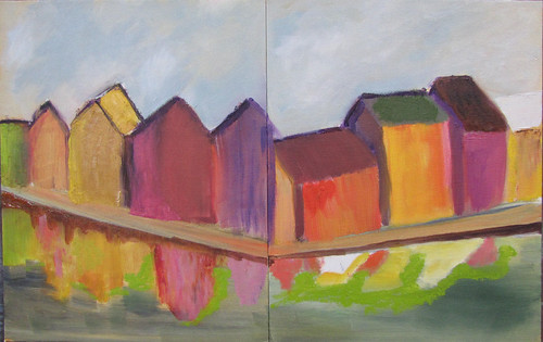
 The downstairs gallery had a variety of works by Don Lent.  The top one is oil on canvas, the lower one, called Electric Power, is an exquisitely detailed water color.  
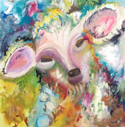
The technical prowess of each artist was inspiring.

Next, I'll write about the adjacent John Hancock Wharf and surroundings.
You can click on most any image to see it full screen.

Saturday, May 25, 2013

When you have nothing to say....

I had one of those experiences recently that made me wish someone else had been given the advice that Thumper gave Bambi:  When you can't say something nice, don't say anything at all.  
Sometimes, of course, there are good reasons to say things that aren't "nice."  But when there is not a good reason and it is (apparently) for the sole entertainment of one's own ego, I agree with Archie Bunker:  "Stifle it." 

 Can you tell I got a new compass?  The Mandala below (colored with watercolor rather than photoshop) is rather clumsy.)

....as is the one below that was colored with watercolor pencil.


A page of thumbnail sketches in preparation for a painting.

Friday, October 19, 2012

So if I sell a painting in my previous state, can I say I am nationally known?!

Ewe and Me
What a pleasant surprise!  One the day before my daughter and I are going to the Rhinebeck (NY) Sheep and Wool Festival, I get a (forwarded) check in the mail indicating that it sold!  Whoo Hoo!!!
It was painted as a contribution to Alley's House, a program with the mission of "empowering teen mothers and their children to achieve independence through support services, education and mentoring.  (They) accomplish this by providing comprehensive case management services, tutoring and life skill workshops."

If you are interested in original art at bargain prices, their next fundraising auction is Februray 2, 2013. (One piece, done by a local charitable "celebrity" went for $1000.00 plus.  The rest of us were happy to get a commission on a fraction of that. 

Tuesday, September 25, 2012

Illustration Friday: Crooked

Let's just say there have been fits, starts, hiccups and set backs this year.  Not all bad, but not all easy or hoped for, either.

Monday, March 12, 2012

Geographical Impossibility by Sultry
Geographical Impossibility, a photo by Sultry on Flickr.

These two Fredrix canvas panels ended up having related colors, but one is of a photograph of Trondheim, Norway and the other of Husum, Germany. In the originals, the "architecture" is very different one from the other. One set of buildings is ornate and on land with a street, marina and water in front of them. The other set is on stilts, above the sea, and with reflections. Like the previous set, I am trying to merge the two pieces so that they will "go to gether" on a wall, even if not in "real life."

Diptych of Overpainting by Sultry
Diptych of Overpainting, a photo by Sultry on Flickr.

I'm not sure where "my" sheep have gone... but I've been painting "out of my head" or from the heart recently. Today's adventure was absorbing, with interludes of sadness when I found myself thinking about having to find a new studio and "gang" to paint with.

I didn't like the sad feelings, but I'll probably risk them again next week. It's sort of like therapy! (And goodness knows, therapy sometimes involved sad moments, too.)

These were originally quite different.
http://www.flickr.com/photos/painterwoman/5880023770/ is the more recent one. The other was the very first canvas to which I applied paint... and I was doubtful enough about it that I never posted a picture of it! (Don't worry, it was horribly amateurish... Still life/bowl/fruit/bottle which all looked like they were made of either felt or poorly shaped Styrofoam!.

I'm hoping that I can make amendments that unite the two pieces.

Monday, January 30, 2012

Works in progress
The reference photo for this shows lots of architectural detail along the roof line, and smallish power boats tied up along the edge of the canal. It will be a challenge to give more of an impression of the quirks WITHOUT getting too rigid.
A similar reference of houses/apartments on piers along a canal.
I used a red under-painting to try to keep this farm/barn scene warm.

I have no idea where I'll go with the coloration... but will tone down the reds with some sky-ish and grass-ish colors. I've added some grey blues and greens, ochers with photoshop.
Still wanting to keep the brushwork loose.

Friday, December 23, 2011

Messenger by Sultry
Messenger, a photo by Sultry on Flickr.
Multiple layers of images of dendrites, neurotransmitters, etc, tweaked and intensified in photoshop.

Monday, December 12, 2011

Monday, November 28, 2011

Monday, November 21, 2011

Wild and Woolly?  by Sultry
Wild and Woolly? , a photo by Sultry on Flickr.
Have you ever been depressed and not realized it? I was for the past three or four days. As always, there was more than one reason, but the main one was being OVERWHELMED by what there is to do before we relocate. I thought I'd boxed myself in by making an appointment with a Realtor. Then it dawned on me that WE were in charge, and I could put the meeting off, which would allow for more time to de-clutter.
WHAT A RELIEF.

Wednesday, November 09, 2011

This is actually mixed media as I started with fabric dye on a rubber stamp, then painted acrylic craft paint on a layer of wax, then stenciled contrasting colors and finished up with a bit of pearl ex.
2011-November-8-004-w