Showing posts with label Boston MFA. Show all posts

Friday, November 14, 2014

Jamie Wyeth seen anew at the MFA


Portrait of a Lady (detail)


 I was quite familiar with Wyeth's ram, but had NOT seen his Portrait of a Lady.  Her expression is pert, intelligent, challenging and made me smile.


Detail


 The brush work (impasto and who knows what else!) on the fleece was varied, original and amazing.
Detail
 The canvas for this Raven was nearly five FEET Square.  Magnificent.  I would build a new mantle if I could have this over it.

In addition to graphite portraits of all three Kennedy brothers (and the famous oil painting of President John F. Kennedy), Wyeth did series portraits of several people:  Andy Warhol (with his dachshund), Rudolf Nuryev (apparently from memory!!) and a friend who was concerned about getting drafted in the Viet Nam era.  The friend got his draft notice on the day the portrait was finished.


His self portrait seems to be a bit more "worked"  but his interesting use of unexpected colors was already in evidence.  (Do you think his torso was really SO green?)

 As part of his military service during the Viet Nam era "he was granted top security clearance[17] and took part in “Eyewitness to Space”, a program jointly sponsored by NASA and the National Gallery of Art in Washington DC, to depict the activities of the Apollo moon mission through an artist's perspective. A total of 47 artists were involved in the "Eyewitness to Space" program, including Robert Rauschenberg, Lamar Dodd, Norman Rockwell, and Morris Graves. Participants met astronauts at launch sites, such as Cape Kennedy, or rode helicopters to observe the pickup of astronauts. Of the works developed, the National Gallery of Arts chose 70 paintings, sculptures, and drawings for "The Artist and Space" exhibit that ran from December 1969 to early January 1970.[18]" (Wikipedia entry)


He had at least two Jack Russel Terriers and both of them had frightening experiences in the ocean.  This quick painting commemorates the rescue by other sailors of a very wet and cold buddy.

Below, Tiller recovers from a similar mishap (sliding off a sailboat, I believe.  I love how Wyeth caught his puddling wetness.
A youth in Maine sometimes served as a model.  The object in the background is the jawbone of a whale, which Wyeth's wife gave him as a gift. The curator's note indicated that the similar sheens and coldness of boy and bone were intentional, and a commentary on the difficulty of the whaling life.

 Wyeth's cheerful sketch of his wife, Phyllis, catching snowflakes.  She was partially paralyzed in her early twenties and used canes or a wheel chair to get around.

 I was struck by the imaginative perspective of this painting of gulls in Maine.  If one doesn't think about it enough, it would seem that the shadows on the building belonged to the gulls rather than trees which are almost out of view.

 Although Wyeth apparently liked to draw architectural details, particularly steeples, he lopped this one off for the sake of an almost symmetrical composition.

Note his pleasure in drawing the shutters and reflective window panes.
 It's a good thing this one had a title and an explanation.  Took me forever to figure out what it was, but then, of course, it rang a bell.

 A Maine Lighthouse made less cliched by the prominence of purple iris and the missing light assembly.

Even though the iris seem to be an "extra" component, they are painted with just as much artistry as any other square inch of any other painting.
Until I lived in New England, I wouldn't have believed that you could have so much contrast between snow, shadow and sky.  I still struggle to notice where sun and shadows actually strike.  But I loved how the bright snow draws one into the very center of the painting.  The interesting crow silhouettes don't hurt, either!

The enormous wrecked propeller was described as an artifact of the difficult life on the ocean.  I think the dogs are proof that life and living go on!

 Wyeth is known for several pumpkin paintings.  This one is watercolor.  (He often uses gouache as well.)  The convincing depth of the crack in the rocks was startling, as were the directive strokes in the stem and its shadow.

 His wife having fun again!  And smoking a cigar. 
 Wyeth visited the White House during the presidency of George W. Bush and left a sketch of Miss. Beazley, Barney and  Willie, the cat.
 Wyeth apparently loved to paint cardboard as well as paint ON it.  He liked the varied textures, shadows and utility. his painting was a take off on Kelloggs rooster mascot and corn flakes.
 
After seeing the painting of the Bale in person, I can well imagine that Wyeth dreamed about straw and hay.  This seems more like a portrait of the bale than an impression of one. The colors he found and used are unexpected but "perfect."
Detail

Close up.  Some of the strands of straw were scratched out rather than painted in.

 
 More cardboard and chickens, with an amazing rendition of the 10W-30 oil logo
Before Pamela was injured she was a fine  horsewoman (even steeplechase riding!).  The caption in the  museum pointed out that the dog is "leaning into the turn."  Such a detailed imagine Mr. Wyeth has!


Artists often struggle with symmetry.  Two paintings explored the theme;  One with an old and older house on a bluff and another with twin girls he met in line at a grocery store.  Wyeth was bold enough to ask their mother if they could pose for him.  I enjoyed seeing pairs which were "the same" but different. 


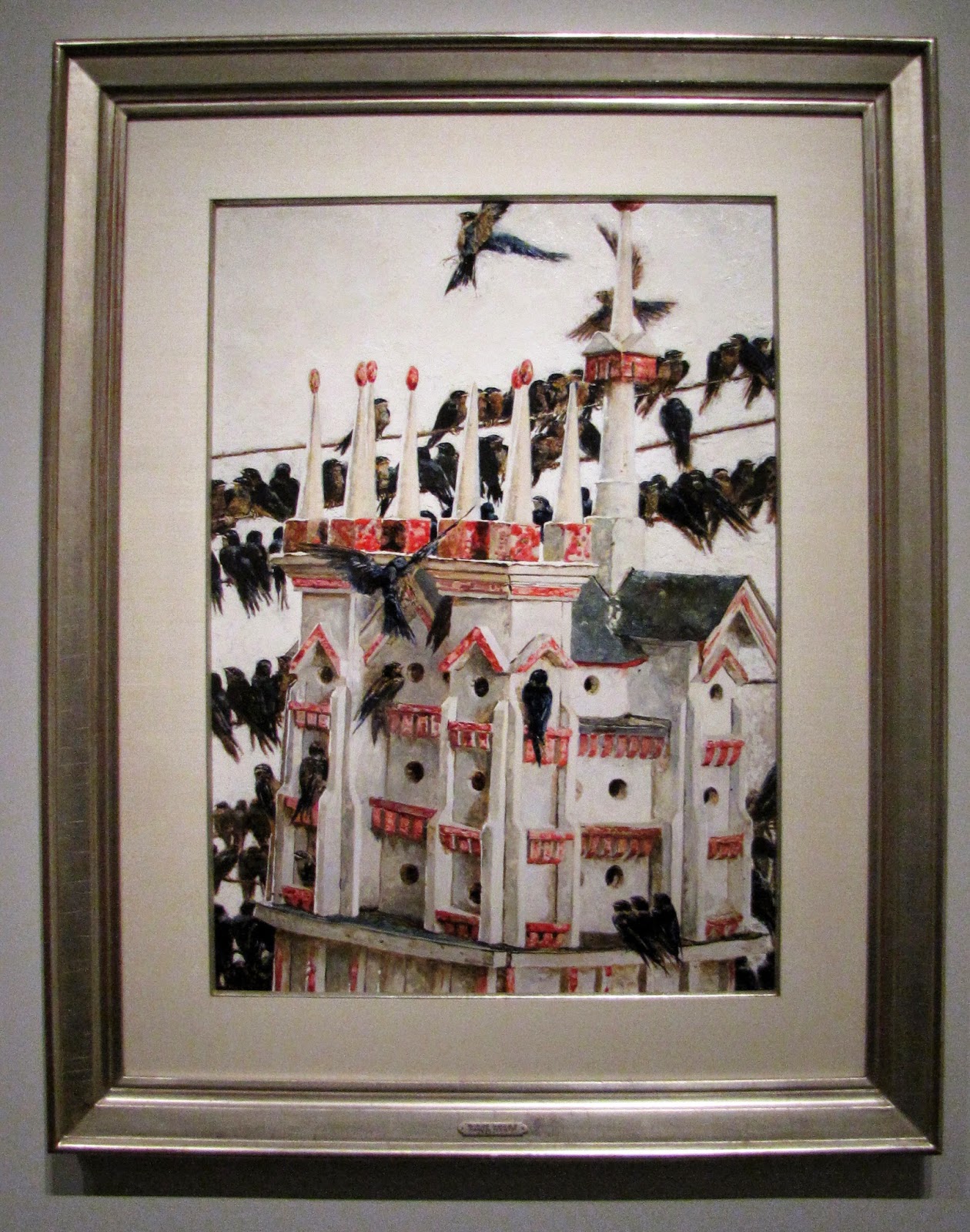
Somewhere I read that there is at least one if not more books of bird and ornithology related paintings.  I'm sure some would thrill ornithologists, but the one of purple martins swarming a palatial birdhouse seems to make a social commentary as well. Consider apparent public housing (i.e., crowded and a bit off balance) and the joys of a good meal, even if it is a dragonfly. 


After 9/11, Wyeth is said to have seen this home with an enormous flag while in Pennsylvania.  The overt expressions of patriotism and the need for deep reflection, even when dark and partial  is his commentary on the events of that time. 

  Similarly, he painted scenes of Maine beset by icebergs and storms.

There was almost an entire room of paintings of crows and seagulls. Amazing how vibrant "black" and "white" can be with the addition of just a little color.


His series on the Seven Deadly Sins has been widely shown.  I don't know if it is the paintings themselves that provoke me, or the amazement that one could conceive of such a combination of theme and subject.

Lust

Anger

Pride

I totally understand the challenge and delight in painting animals, whether wild or domestic, and Wyeth has created a bounty of wonderful images of chickens, pigs, goats, sheep, dogs and horses.  I am less clear about what prompted him to paint these three frisky, goofy goats peeking out from behind an enormous tree trunk.  I do know that it would be a challenge for me to make a tree trunk look even one tenth this interesting.  (not to mention those realistic goaty lurkers.)
 As usual, the information desk had great floral arrangements.  Next time I might borrow one of their portable camp-stool type seats and plot myself right in front of them to sketch!
The exhibit is on through December 28 (although parts of it will be going to Chadds Ford, PA, San Antonio, TX and Bentonville, AR in early 2015.


Sunday, November 09, 2014

Observing by Drawing at the MFA

I have found that sometimes I prefer museum-going by myself.  Because I concentrate on what is interesting to me and don't "worry" about being nice to whoever took the trouble to go with me.
That was the case today when I went to the exhibit of Jamie Wyeth paintings at the Boston Museum of Fine Arts.
 This crow/raven for instance.  It is a large piece, probably nearly 5 feet square, oil on canvas.  To get an image that looks like a close up, one would have to also stand far away while you were painting.  I sat, mesmerized, on the convenient bench in front of it, and looked for major shapes, highlights, contrasts and brushwork.  For me, it ALL worked.  The detail on the claws alone was breathtaking.  (Wyeth apparently spent several years doing anatomical studies in a New York morgue... and while I doubt there were crows there, the learning transferred.

 This was also my first use of some Faber Castel Pitt pens.  I only have a set of 6 (they come in 58 (!) colors. I love their vibrancy... even if they do seem to be about $2.50 each.  Some of the other colors you see are Faber Castell colored pencils and water soluble crayons.

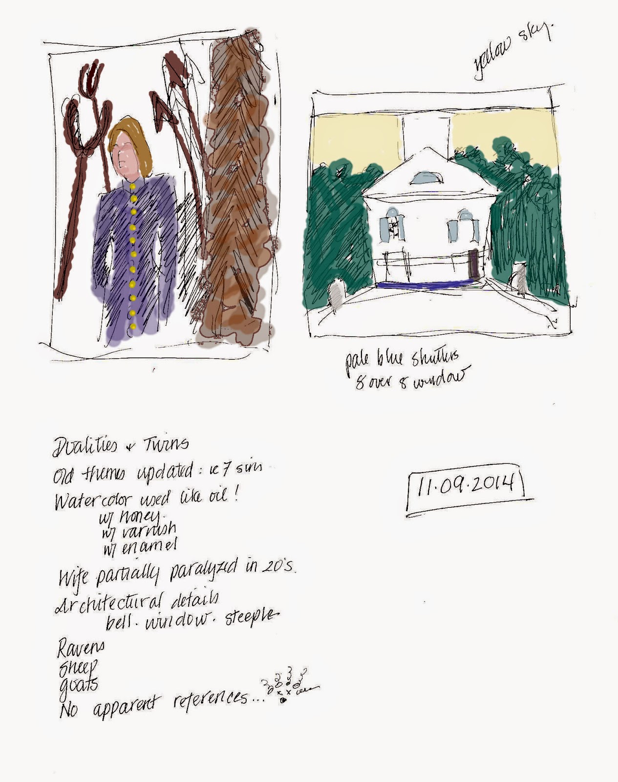
From the same seat I did these little compositional studies.  The model on the left is supposed to be representing the American Whaling industry/experience.  To me it looked more like someone stuck in Hell, rather than a seaman surrounded by harpoons, tridents and oars.             The other image is of a church.  Wyeth's composition lops of the steeple, in spite of the fact that he apparently really liked painting JUST steeples.  This one was watercolor and had exquisite detailing of the clapboard siding and window reflections.

I took a LOT of photographs.  So watch this space!
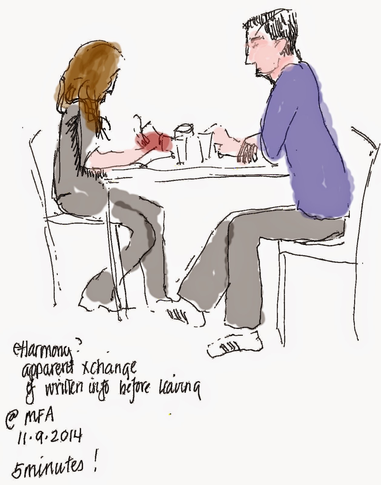
I considered having a cup of coffee while I digested my viewing experience, but decided, instead, just to sketch this couple.  They certainly were paying close attention to each other.  When they each took out tablets and paper and pencil, I surmised they were on some sort of "first date," and had decided to at least exchange email addresses or phone numbers.


Saturday, May 18, 2013

MFA Adventure

Considering how much I expected to visit Boston when we were planning our move to New Hampshire, we have only "gone to town" a few times.  We've been thruough town almost monthly to visit our beautiful granddaughter... but not so often to sample the cultural offerings.  So I made sure I had comfortable shoes and fresh batteries when we went to the Museum of Fine Arts last week.
While DH was unimpressed with the small room of Michelangelo pen/ink sketches and drawings, I was inspired, because they looked "doable."  Not quite in the "my kid could do that" category, but still doable.  There were conceptual thumbnails of buildings and then more and more detailed drawints.
A small Henry Moor caught my eye:  Seated figure against a curved wall.  Loved the textures and kind of awkward pose.
I thought Miro's "Nuages et Oiseaux" (Clouds and birds) was a sheep at first!
The Blue and White Exhibition had been highly recommended to us by my daughter, and indeed was more thoughtprovoking and interesting than I expected.  It was not merely a mish mash of historical pieces in blue and white, but included more contemporary uses of blue and white to both emphasize and contradict tradition.  I might have to do a series of "just blue and white" paintings in response.

Artists in Holland combined traditional windmill shapes and blue/white colors with other traditions (as with this Middle Eastern Calligraphy)  to incorporate the impact of immigrant groups.
This contemporary convolusion by a Japanese artist demonstrated amazing technical skills while appearing organic.
Another contemporary installation used a bit of everything: big floor vases, fiber, and undulated wood "shelves" with all sorts of ceramic objects and figures.  It was overwhelming to look at in a "reasonable" amount of time.  I can't guess at how long it took to construct!
The piece below by Annabeth Rosen who lives in the same town as my college roommate, was titled "The Wave."  It was made with ceramic pieces and held together with baling wire.  I've only ever thought of baling wire as a metaphorical entity.  Not something you could actually USE!

Thse jars were about 4 feet tall.  The women's figures, in red, were painted to look like electronic circuitry, and the explanation referred to the value of "the motherboard."  I like puns... whether visual OR verbal.

The stenciling and high contrast between "white" and cobalt was very appealing on such simple shapes.  They reminded me of mid-century Scandinavian pieces my mother had.

How does one neatly cut holes in a plate or bowl?  The re-use/recycle of a number of pieces was breathtakingly creative.
 
Here is a stack of carved plates and bowls, reconstructed to make a more dimentional landscape scene.

The shadows on the teacup paintings  were IN the images, not an artifact of my dubious photograph.  I liked the series.
In this elaborate piece, I thought the shadows cast by the texturing was the most startling.  I don't know if the whorls and bumps were carved, pulled or cast.  Shiny glaze over varied texture was interesting.  I might have to try to draw this.


There was an "old style" wood surfboard which had been covered with a THICK layer of transparent resin into which blue, white and black images had been laid. There was depth to the images even without the black shading.

Sort of an Apple apple.
Would you make art about happy memories or disastrous ones?  I can think of other examples of both kinds.  But rarely is the art relating to "disasters" as "pretty" as these Delftware grenades!


We wandered around the rest of the museum.  For some reason this chandeliere was blinking on and off.  I was SURE I had gotten it while on.  So much for certainty!
There was one small gallery of "craft" objects.  This huge glass basket by Brett Young of Cleveland was , made from flame-worked pyrex was beautifully illuminated.  The artist was apparently inspired by tangled heaps of rebar at a construction site.
Philip Moulthrop, in the middle of three generations of Georgia wood artisans, combined slices of wood and dyed epoxy resin to make a block which he could "turn" into this bowl form.  The polish and shine made me want to touch it.
Wouldn't you know that this glass vase was by the ubiquitous Dale Chihuly.  Unlike his later organic flames and flowers, this "Navajo Blanket" vase is from the mid 1970's.
Another artist made a piece about waves. John Cedarquist of San Clemente, CA, made "How to Contain Five Waves" with nods to Hokosai and the Buddhist book popular in the 1960's called How to Wrap Five Eggs.  My uncle had that book on his coffee table when I was a teenager..
This "Construction #8" is by Nancy Crow.  The museum information gives her credit for being a founder of the contemporary art quilting movement.  GO Nancy! 
Jeweled Wall is crocheted and beaded by Elizabeth Tuttle.  The piece is aproximately 5 x 7 inches and mind boggling.
Linda Behar, from Cambridge, Massachusetts definitely captured the essence of "Salt Marsh I" using hand and machine embroidery over acrylic, based on her own photographs.
This 19th century bronze is supposed to be Dante and Virgil. Looks somewhat homoerotic to me... unless it was really supposed to be Dante and BEATRICE!  What do you think?
There was a newly opened display of Rembrandt paintings


Talk about realism!

Something about this work (monumental in scale) made me laugh.  Orpheus Charming the Animals reminded me of earlier Netherlandish paintings in which there was lots of sub-text and symbolism.  What peculiar animals Aelbert Cuyp chose!  A pangolin?  Where would an artist have seen such a variety.  (But note the common kitty and dogs.)

Sparkly stuff is always a big hit!

Quite a sewing box, don't you think?
And then just around the corner were ancient Mesopotamian artifacts.
Although these cattlemen were probably created to go into a burial chamber, it reminded me of a child's toy.  These are at least 1000 years BCE.


Then we had a high priced lunch and came home to digest all that we had seen.