Showing posts with label painting. Show all posts

Monday, November 24, 2014

Change of Seasons at George Marshall Store Gallery

Lisa Noonis:  Blue Berries
After the hours I spent "curating" my visit to the Unraveled exhibit in York, I'm just going to post the pictures I took at the Change of Seasons Show down the road.  This show will be up all winter while Ms. Harding scouts new talent. 

There is a list of all the artists on the GMSG web page HERE .  On many of the photos, you can double click to "original" size in order to read the label. Now I feel remiss in enjoying the show rather than really documenting it.  Well, it will be up through Spring, so maybe you can go see it in person!

 In the meantime, get inspired, enjoy, and make art!

There's almost always something "tasty" just as you enter the storm door!

Grant Drummler:  Swimming Cove

Kate Emlin:  Aouze

Madeleine Hopkins:  Winter Sun

Jenny Potter Scheu:  Summer Tapestry

Add caption

Encaustic!  Just one piece, but definitely different.
Arthur DiMambro:  Room With a View

Lisa Noonis:  City on the River

Louis Bourne:  Island Badminton

Brett X. Gamache:  Fisherman Rowing and Gulls
Lisa Noonis: Harbor Beach
Lisa Noonis
  
These are gouache... applied, I think, as if they were oils.  Small but strong works.


Madeleine Hopkins
 The painting below uses all the crazy colors I love.  Sort of a wild child! 

Ann Trainor Dominque:  Falling Toward Winter


 The painting below is actually watercolor on paper, then varnished.
 Watercolor and ink.  This was so different from everything else! Looked almost Japanese to me.


 This funny little painting looks just like one of Portland's Casco Bay  islands.  The jagged light line of the sun highlighting clouds is so primitive, but so "true"  just the same.
 Kathleen Galligan has the solo show on the lower level.  There were oils as well as pastels; landscapes as well as abstracts.


Sunday, November 09, 2014

Observing by Drawing at the MFA

I have found that sometimes I prefer museum-going by myself.  Because I concentrate on what is interesting to me and don't "worry" about being nice to whoever took the trouble to go with me.
That was the case today when I went to the exhibit of Jamie Wyeth paintings at the Boston Museum of Fine Arts.
 This crow/raven for instance.  It is a large piece, probably nearly 5 feet square, oil on canvas.  To get an image that looks like a close up, one would have to also stand far away while you were painting.  I sat, mesmerized, on the convenient bench in front of it, and looked for major shapes, highlights, contrasts and brushwork.  For me, it ALL worked.  The detail on the claws alone was breathtaking.  (Wyeth apparently spent several years doing anatomical studies in a New York morgue... and while I doubt there were crows there, the learning transferred.

 This was also my first use of some Faber Castel Pitt pens.  I only have a set of 6 (they come in 58 (!) colors. I love their vibrancy... even if they do seem to be about $2.50 each.  Some of the other colors you see are Faber Castell colored pencils and water soluble crayons.

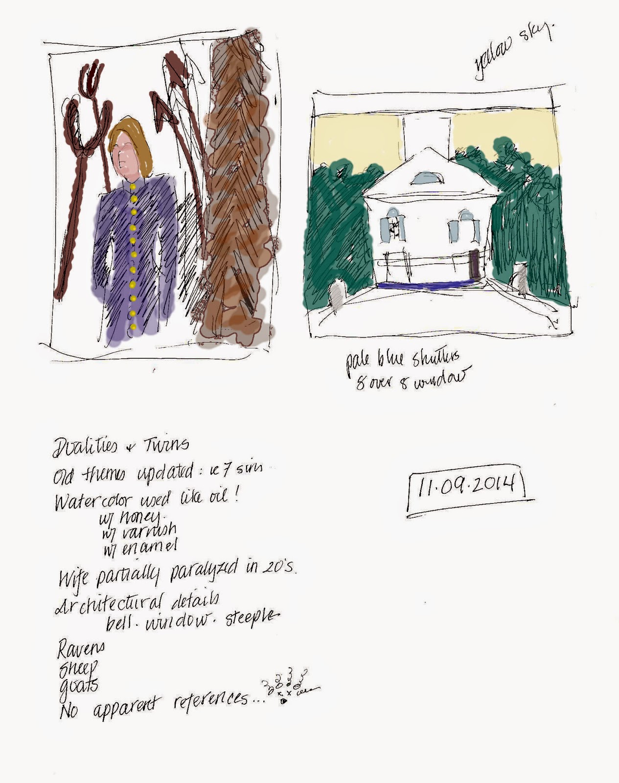
From the same seat I did these little compositional studies.  The model on the left is supposed to be representing the American Whaling industry/experience.  To me it looked more like someone stuck in Hell, rather than a seaman surrounded by harpoons, tridents and oars.             The other image is of a church.  Wyeth's composition lops of the steeple, in spite of the fact that he apparently really liked painting JUST steeples.  This one was watercolor and had exquisite detailing of the clapboard siding and window reflections.

I took a LOT of photographs.  So watch this space!
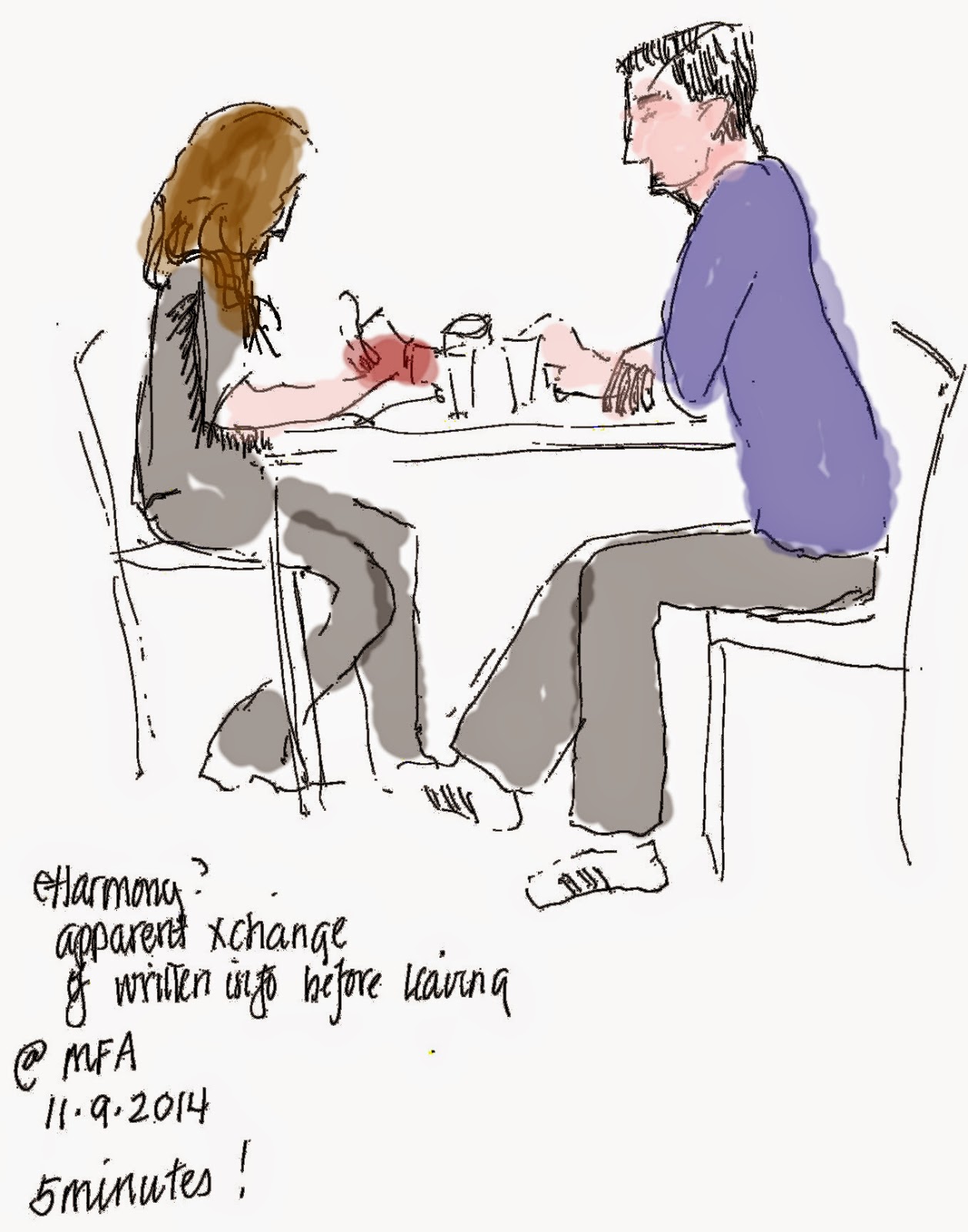
I considered having a cup of coffee while I digested my viewing experience, but decided, instead, just to sketch this couple.  They certainly were paying close attention to each other.  When they each took out tablets and paper and pencil, I surmised they were on some sort of "first date," and had decided to at least exchange email addresses or phone numbers.


Wednesday, July 02, 2014

Liking Me Some Ribbons

I've made friends at the Nashua Artist's Breakfast Club and a high percentage of them are paid members of the Chelmsford Art Society.  The CAS seems to be a fairly small but pretty enthusiastic group of artists and art lovers.  I haven't met all of them, but I've been to a couple of their monthly artist demos... (Paul Pedulla and Stapleton Kearns), both of which were worth the 35 mile trip and gas mileages.

Well, one of the whing dings I heard about from last summer was their July 4th Show.  First of all, you have to understand that Chelmsford does 4th of July like they invented it.  Granted the town is pretty near Lexington and Concord, but just the same...!  Residents start claiming parade seating with lawn chairs on the 1st of July AND NOBODY MOVES THE CHAIRS.  What a nice community tradition, don't you think?

Their parade is on the 4th and there's a carnival... and in the past the art show.  This year the brilliant Co-Presidents decided to have the show hung and judged  by July 2 so there could be an adult reception  on July 2... and you could actually get to it!  (Having lived in Pasadena, California for almost 30 Rose Parades, I can tell you that trying to cross a BIG parade's route on the day of the parade is pretty near impossible.)  Chelmsford's roads clearly developed from crazy cow paths, so the traffic is even more challenging.

Anyway, I picked some paintings, got them framed and ALMOST didn't enter them.
Art shows have a pick-up dates and it is bad form not to pick up your paintings on time.  Well, as it turns out, I have some medical issues and an appointment which was going to interfere with picking up the submitted works.  But I listened to my enthusiasm and approached a Breakfast Club Friend and asked if she'd be willing to pick up my paintings.  She said yes!  And so I submitted the limit:  3 paintings.

And yesterday I got a call to encourage me to go to the reception because I'd won something.
When I arrived, I found out I'd won two somethings. Surprised and totally delighted.

Second Place in the non-professional pastel category for "Wild and Woolly"...

 Third Place for The Good Rooster (Crows Everywhere) in the Oils/Acrylic category.
The irony is that the one I liked most (titled "Attitude) and the one that elicited purchase inquiries, didn't win anything.  Must remember that prizes and what I like aren't necessarily related... although I clearly DO like prizes!
Sunday, June 29, 2014

500 bad paintings minus two...

There is an awful lot to learn in these "little" 6x6 paintings:  Color mixing (and matching), brush work, shapes, strokes, shadows, proportion, composition, etc.!  Good grief.  For how little the paintings looked like the reference set-up, I was surprised that the colors matched at all. I guess with a small painting, the errors are proportionately BIGGER.


 I bought a sunflower for a fresh start.
Even with so few colors, the variations and brush strokes seemed impossible to get "right." Now I understand why so many people say you have to do 500 bad paintings to get a good one.