 On Thursday, I met two friends at the MFA (Boston) to see their new acquisition, the Pilgrim/Roy Quilt collection. The exhibit was beautifully arranged with an emphasis on color theory. After total satiation in stitches, fabric, geometry and color, we had lunch, a breezy stroll through "Boston Loves Impressionism" and a meander through one of their four gift shops.
A picture of some of the 1700+ fabric flags offered from across the country is posted at the end of this post. The recognition that so many students from so many places made tangible what I think is best about the United States: caring, cohesion, and creativity. Nice to have so many bits and pieces in celebration and in honor of the Boston Marathon, the runners and the injured while the quilts are in the vicinity exemplifying how diverse bits and pieces can make a beautiful whole...
Perhaps instead of using a "melting pot" metaphor, we should look at the United States as one HUGE crazy quilt!
I'm not a quilter (at least yet), but I've been to several big quilt "shows" and exhibits and always find them inspirational. The amount of work, talent and affection they represent is huge and often breathtaking.
There are lists of upcoming quilt shows here, here, and here. And if you are near Lowell, MA, don't forget the New England Quilt Museum!

The first room included quilts that used complimentary colors (i.e., opposite each other on the color wheel). It turns out that Pilgrim and Roy both really liked the color orange... so there was LOTS of orange.
(I really liked the sunflower stitching pattern in the detail shown above).


After "compliments" there was an area of quilts made of analogous or more closely related colors. I was delighted that their explanatory panel quoted (verbally AND artistically) one of the foremost color theorist, Josef Albers.


This blue has some red in it and the "red" has some blue in it (believe it or not)... so they soften each other and blend a bit more than the complimentary colors which (ironically) are a bit more combative.


This pattern is apparently known as "snail's trail." It looks like it has curved pieces, but it is actually made of small and smaller geometric (i.e., straight-sided shapes) like you can see here. At the same time, notice how related colors run on the diagonal, the top and bottom rows are the same, but none of the other squares fit any recognizable (to me, anyway) pattern.


(Sorry this explanation is so fuzzy. The room was VERY dark to protect the colors, flashes were prohibited, and I don't travel with a tripod...:-( ) But Amish quilts are famous for their intense yet compatible colors.
The colors of this quilt are somewhat muted... and each main color actually has a pattern which adds to the interrelatedness of the stripes.
The "Thousand Pyramids" quilt below uses amazingly fresh colors with lots of lavender, salmon and Prussian blue, combined with very light and dark neutrals and that nifty green. Note also the almost Celtic style braided pattern on the border. More about this quilt pattern here.


Again, muted contrasts and simplicity in piecing, but elegance, even extravagance in the stitching and rich colors.

 Sol Lewitt was especially known as a conceptual artist and minimalism. I think of his work as being celebrations of DESIGN. The quilts shown in the
category of "Variation" emphasize gradations of the same colors...
either working around the color wheel, or ranging lighter tones or
darker shades of the same hue in rows, diagonals or squares.
Sol Lewitt was especially known as a conceptual artist and minimalism. I think of his work as being celebrations of DESIGN. The quilts shown in the
category of "Variation" emphasize gradations of the same colors...
either working around the color wheel, or ranging lighter tones or
darker shades of the same hue in rows, diagonals or squares.


I think this example IS about the piecing. Those little squares (pixel-like!) are SMALL. I'm thinking this quilter didn't have a cat or toddler to "help" with the layout or basting.
I'm not sure what the name of this next category was. (I was overwhelmed by now). But these quilts all used a lot of white, and tended to be of an older vintage than most of the rest.
Most of the other museum patrons sounded as if they had at least some quilting knowledge. I was tickled that this couple was talking about how some of the squares weren't perfectly aligned. They loved the quilts and weren't really complaining... but I think we all like to find fault! (And are sometimes proud of our ability to find fault with things we can't do ourselves).


More Variations!
This was one of the first quilts in which I noticed that there were lots of patterned fabrics. Most of the others used solid colors. I think this variation of the "log cabin" quilt block is known as a Trough Log Cabin, because of the diagonal bands of colors.


How sneaky is our brain to convert light and dark (flat) shapes into advancing and receding three dimensional forms?


Can you see squares, diamonds AND hexagonal "flowers" here? If you look for very long, it's as if your brain gets tired and shows you a different view.
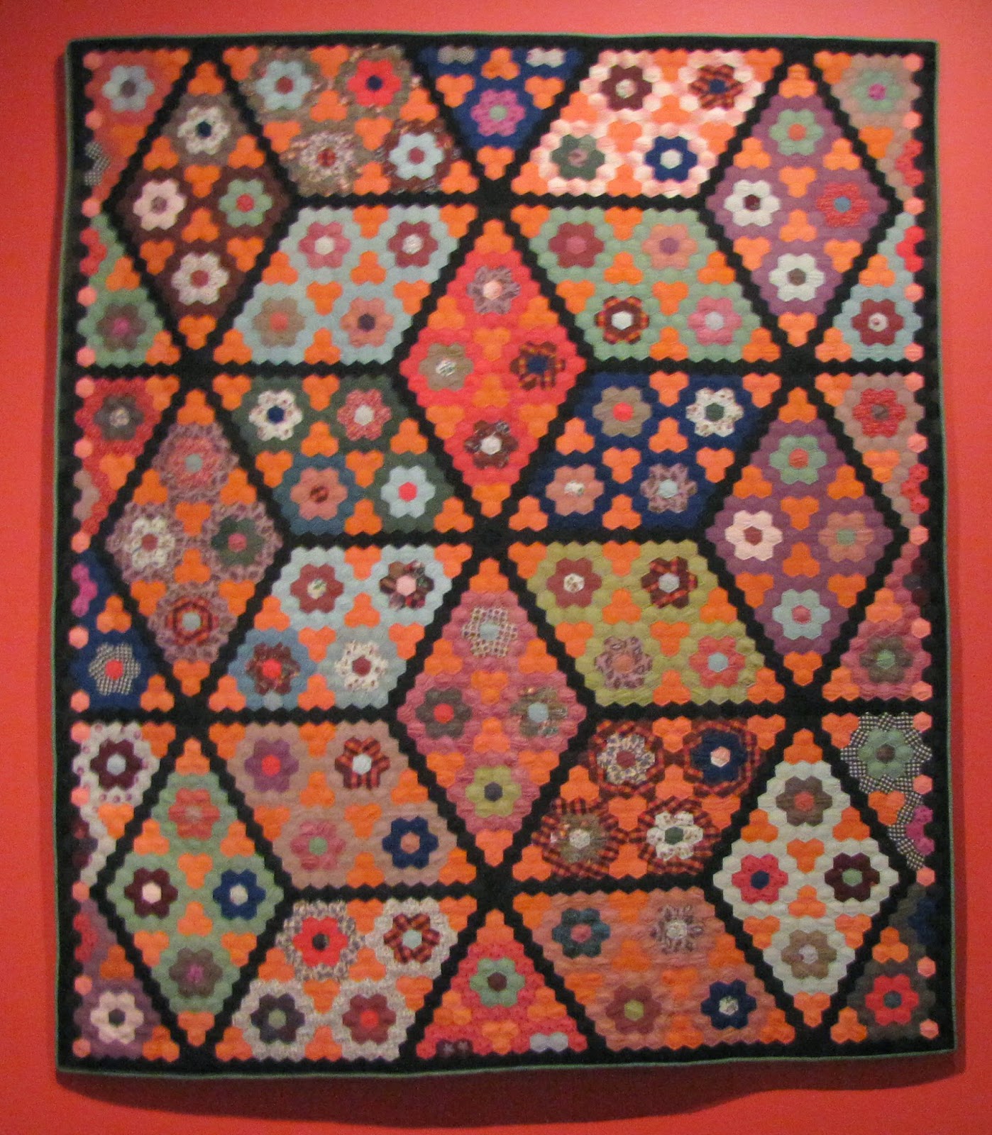


Other wise, the colors seemed to be pieced randomly. I'm surprised that their wasn't an accidental "glob" of one color, though.
Be sure to let me know if you DO see an organizing principal!
 Detail of another Thousand Pyramids Quilt using lots of differently patterned fabrics.
Remember that only simple geometric pieces were used to make these complex shapes. This one made me wish I had a huge box of Tangrams to play with! It's hard to wrap my head around the rick-rack effect and mere triangles and squares.
The final gallery of the exhibit showed quilts that had individualistic, inventive and unusual approaches to color, design and tradition.
This quilt reminded me of the paintings by Sean Scully.

Naming it Crosses and Losses seems brilliant. Perhaps a work of art AND healing.

 I wish I'd known Corita Kent. Who knew a nun would advise that one Throw Caution to the Wind?
The quilt above has spirals of fabric which were called bullseyes. It gave a 3D aspect to an otherwise two dimensional quilt.
The quilt below, with it's much more modern color palette is tied rather than quilted... but the colors of the ties vary depending on the color of the fabric. (Another opportunity seized to use compliments... and lots of orange!)

Note that most of the ties are orange. But ties on orange pieces tend to be blue!


This whimsical Double Wedding Ring patterned quilt uses colors and contrast to pump up the energy of the work. The non-traditional scalloped edge is another sign of artistic independence.


Of course we spent some time in the gift shop. I might have to get the book... and I might wait until the price goes down! Don't you love the slumped glass trays (a la Kandinsky) in the background?
The felted necklaces were a bargain and tempting. I believe they are made by women in India who are contracted by a California company, owned by an Indian woman.


 Sometimes I miss having sisters. These two would be PERFECT!

 T
T
No comments:
Post a Comment